Lisa Bron

Despite glowing 5-star reviews, the training center was invisible online.
The previous website struggled with poor navigation, an outdated design, and low user engagement. Ranking 21st on Google, it lacked the visibility needed to attract visitors. As a result, conversion rates were just 2% — well below the industry average of 4–6%.
What Users Told Us
I asked five visitors what they needed most. The answer was simple: price, duration, availability — and 80% wanted online courses.
80% of users preferred online training— an untapped opportunity no competitor offered, that would prove very valuable later.

Redesigning with one goal: make booking easy for users.
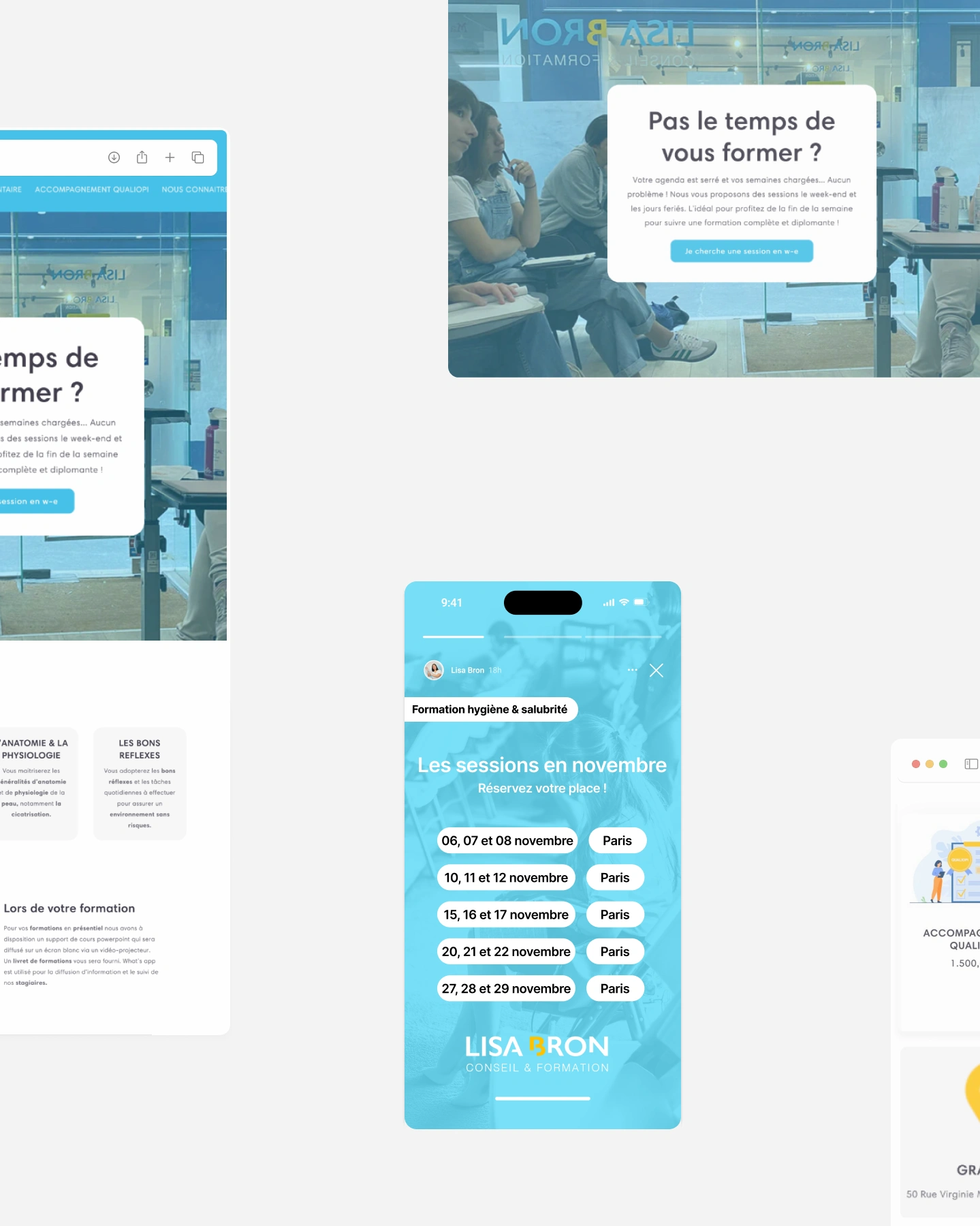
I redesigned the interface with clarity and accessibility in mind — simplifying language, highlighting key information, and using visuals and prompts to guide users. User testing then shaped the final design.

Clear, actionable site with online training added
I simplified the site, highlighted key info, refined content to encourage action, and added online training. The result? Better usability and measurable impact.


By prioritizing users, the redesign boosted both satisfaction and results.
Simple changes to the website structure improved search rankings fast. It now ranked #3 (+11 spots without technical SEO work). Better layout and clear buttons led to an increase of 53% in conversion.
After adding online courses, bookings grew by 225% in 6 months - more popular than in-person classes. The client now ranks #1 on Google for online training searches.
